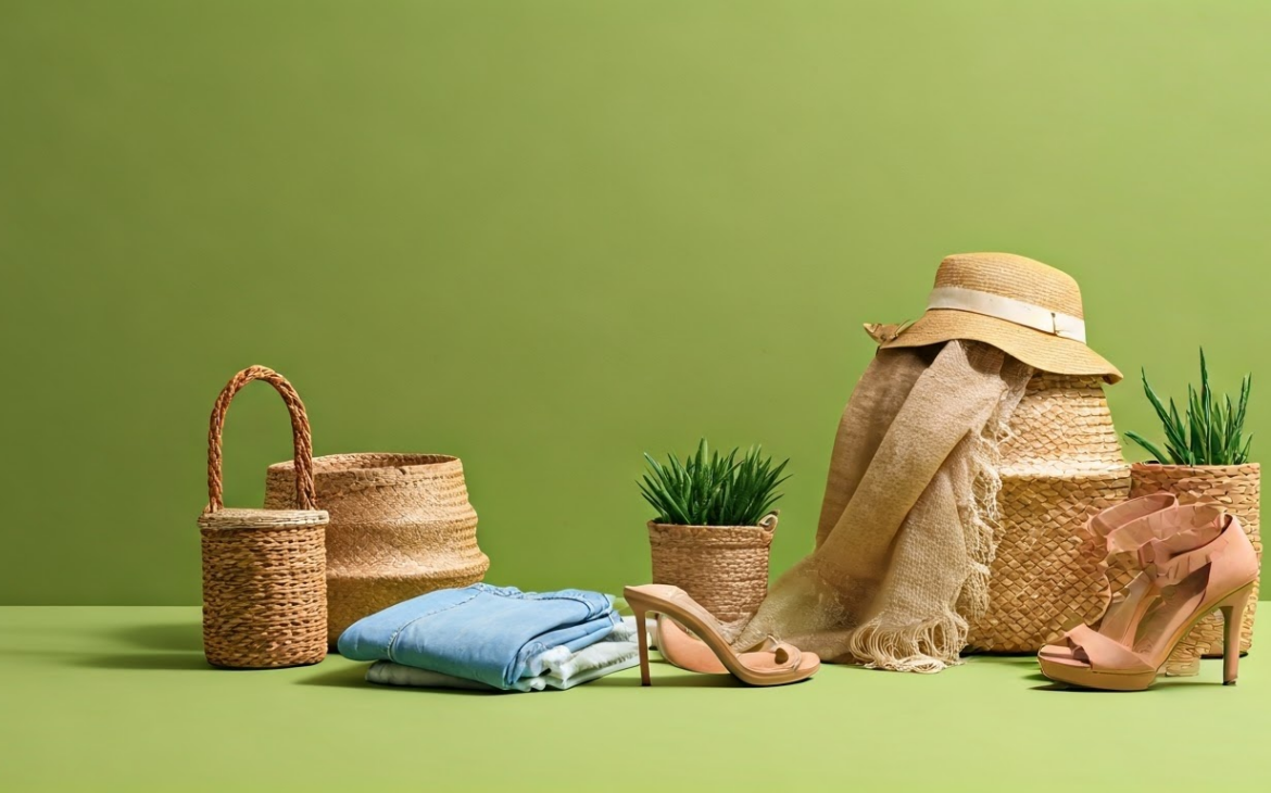
Color theory is a pivotal framework in fashion product photography to get the most out of the models. Our outfit’s color combinations, including a monochromatic color scheme, can say a lot about us. They can set moods, evoke emotions, and make powerful statements about our personal style.
The simplest way to understand the colors we wear is that they can greatly impact how we feel and how others perceive us. This comprehensive guide is designed to help beginners gain a solid grasp of clothing colour theory and basic principles of color selection. If you want to click amazing fashion product photos, it’s best to know your way around colors, to play with hues as per your liking.
Color Theory Basics
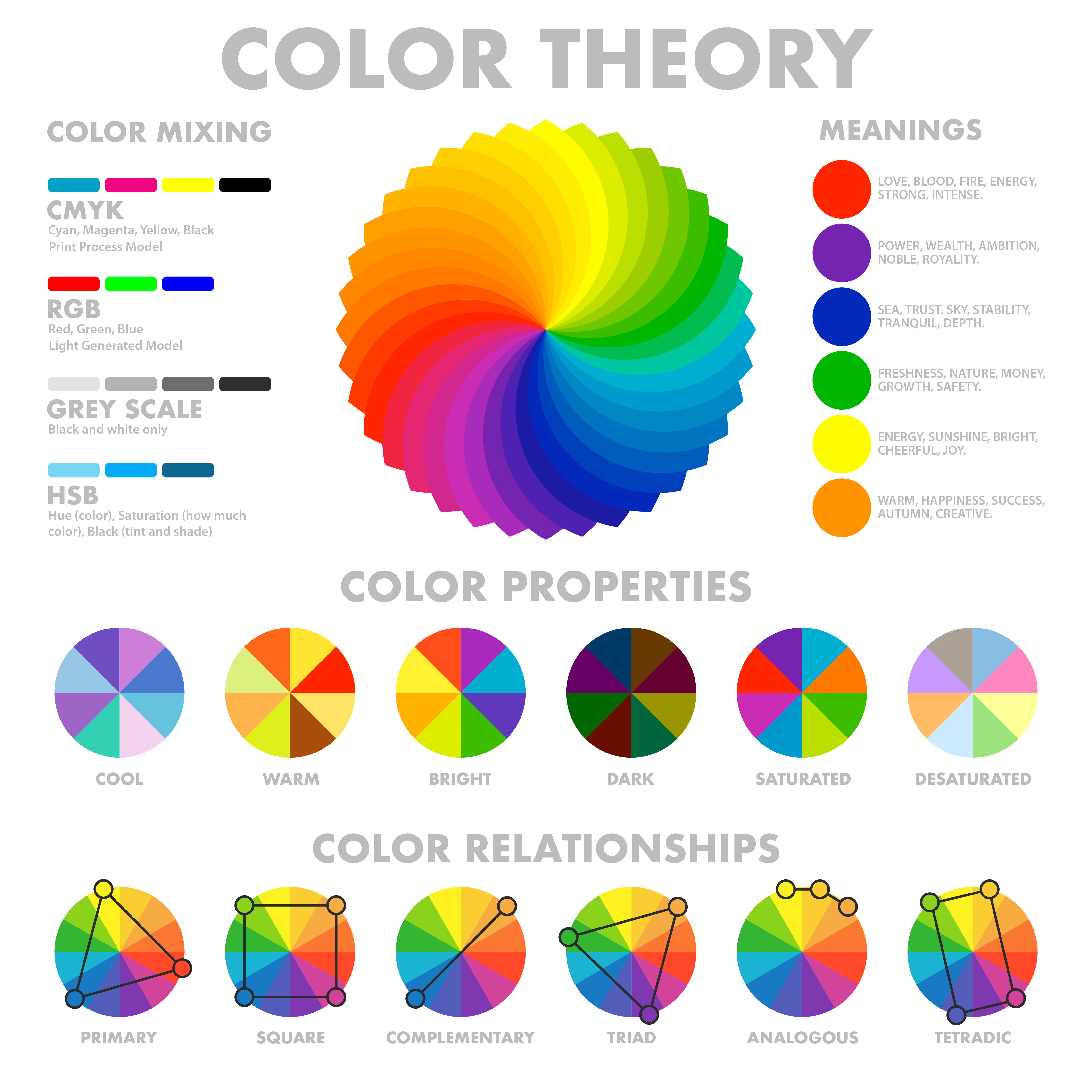
Color theory is a framework that informs the use of color in art and design. It’s a practical combination of science and art. It began when Sir Isaac Newton first revealed the color spectrum through his prism experiments in 1666, and has evolved over centuries. At its core, it helps us understand how colors mix, how they interact, and how they can be used to create certain moods or reactions.
What is the color wheel?
The basis of color theory rests on the color wheel, a circular diagram that visually represents the relationship between different colors and serves as a vital visual representation of color organization. The color wheel primarily consists of twelve hues, including primary colors (red, blue, yellow), secondary colors (mixtures of primary colors: green, orange, purple), and tertiary colors (created by mixing primary and secondary colors). Understanding the color wheel provides insights into how colors relate to each other, paving the way for more informed color scheme choices.
Primary, secondary, and tertiary colors
At the root of the color wheel lie the primary colors – red, blue, and yellow. Primary colors cannot be created by mixing any other colors and form the base for all other colors on the wheel. When we mix two primary colors, the result is secondary colors — green (blue + yellow), orange (red + yellow), and purple (red + blue). These colors reside between the primary colors on the color wheel. Finally, when a primary color and an adjacent secondary color mix, they generate the tertiary colors, which are a complex set of colors such as red-orange, yellow-orange, and blue-green. Understanding these fundamental hues allows you to dive deeper into color theory for clothing, enabling you to harmonize and contrast colors effectively.
Color Schemes in Clothing
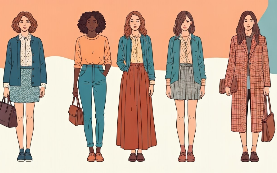
In the realm of fashion, types of color schemes are vital in creating outfits that are visually appealing and expressive of personal style. They serve as a roadmap for combining colors in a way that’s engaging, balanced, and harmonious. Whether you’re assembling an outfit or designing a clothing line, understanding the basic color schemes – complementary, analogous, and triadic – will significantly enhance your results.
Complementary colors
Complementary colors are hues directly opposite each other on the color wheel. This positioning creates a vibrant contrast that can bring a dynamic flair to an outfit. For example:
- Red and green are complementary, resulting in a striking holiday-themed combo.
- Blue and orange create an energetic contrast, ideal for summer or sports attire.
- Yellow and purple paired together offer a sense of intrigue and excitement, often seen in royal and luxurious designs.
When leveraging complementary color schemes, the key to success lies in balancing their use. Avoid splitting them 50/50; instead, let one color dominate while the other serves as an accent.
Analogous colors
Analogous colors consist of three colors that are next to each other on the color wheel. They typically match well and create serene and comforting designs owing to their close relationship, which can also showcase an artistic flair. Examples of analogous colors include:
- Blue, blue-green, and green can concoct a fresh, soothing, ocean-inspired look.
- Red, red-orange, and orange can evoke feelings of warmth and passion.
- Violet, blue, and blue-violet may result in a cool, tranquil, and harmonious visual effect.
When using analogous colors in your outfit, it’s advisable to choose one dominant color, often a primary or secondary color, and use the other two as accents.
Triadic colors
Triadic colors are three colors equally spaced on the color wheel forming a perfect triangle, distinct from the sets of complementary colors that create different palettes. Such a scheme offers a high degree of contrast while retaining color harmony. Good examples are:
- The primary colors: red, yellow, and blue, hold a classic appeal found in many nostalgic and vintage styles.
- The secondary colors: green, orange, and violet, concoct a vibrant and cheerful combination ideal for a bold fashion statement.
Just like with other color schemes, successful use of triadic colors often involves focusing on one dominant color and using the other two for accent or details.
Also read: Boost Your Fashion Product Page Conversions with Experts Insights
Color Psychology in Fashion
Color psychology refers to how colors can evoke certain emotions and behavior, creating different moods. Every hue on the color spectrum carries a specific set of feelings and ideas, which designers manipulate to influence people’s reactions to their creations. From bold reds signifying love and passion to calm blues exuding tranquility and trust, the colors you wear or choose for your designs can tell a lot about your personality, mood, or message you want to convey.
The meaning behind colors
Each color holds specific meanings and is associated with certain emotions or reactions. When you understand the power of these associations, you can harness them to make statements, evoke feelings, or communicate ideas with your attire. For instance:
|
Color |
Meaning |
|
Red |
Expresses power and passion. Often associated with energy and excitement. |
|
Blue |
Denotes stability and trust. Linked with calmness and peace. |
|
Green |
Symbolizes growth and health. Reflects freshness and harmony. |
|
Yellow |
Associated with happiness and positivity. Stands for creativity and warmth. |
|
Purple |
Represents luxury and ambition. An emblem of mystery and magic. |
|
Black |
Conveys elegance and formality. Also related to strength, power, and sophistication. |
|
White |
Denotes purity and innocence. Signifies light, neutrality, and cleanliness. |
Selecting colors mindfully based on their psychological effects can help you achieve specific results in your appearace or the message you want to convey.
How Do You Relate Color Theory to Fashion and Clothing Product Photography?
Color theory is a cornerstone of fashion and clothing product photography, playing a pivotal role in how products are perceived and how emotions are conveyed through images. By understanding and applying the principles of color theory clothing, photographers can create visually compelling compositions that captivate viewers and highlight the unique qualities of each garment or accessory.
1. Creating Visual Harmony
Color theory helps in selecting hues that work well together, ensuring harmony in your photos. Complementary colors, such as blue and orange, add vibrancy, while analogous colors, like shades of green and yellow, offer a more subtle and cohesive look. Applying these principles ensures the image looks balanced and aesthetically pleasing.
2. Highlighting the Product
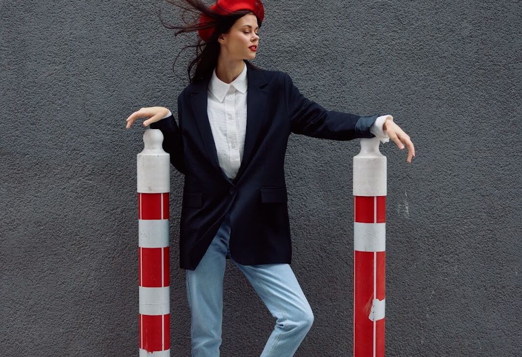
In fashion photography, the product is the star. Using solid colors, along with contrasting tones between the clothing and the background, ensures the product stands out. For example, a vibrant red dress pops against a neutral gray or white background, drawing immediate attention to the garment.
3. Evoking Emotions
Different colors evoke different emotions, which is essential when showcasing fashion products. Warm tones like red and orange convey a sense of energy and passion, ideal for bold and edgy fashion lines. Cool tones like blue and green evoke calmness and reliability, perfect for classic or professional attire. Aligning the color palette with the brand’s desired emotional impact can make the imagery more effective.
4. Conveying Brand Identity
Brands often have a specific color palette that represents their identity. Incorporating these colors into your photography ensures consistency and reinforces brand recognition. For instance, a luxury brand might focus on black and gold tones to signify elegance and sophistication, while a casual brand may lean toward playful and vibrant colors.
5. Enhancing the Viewer’s Focus
Strategic use of color theory can guide the viewer’s eye to specific elements of the photo. For example, using a monochromatic scheme with a pop of contrasting color can emphasize a key detail, such as a unique pattern or accessory on the garment.
aAlso read: Essential Tips for Fashion Clothes Photography
Tips for Successful Color Coordination in Clothes
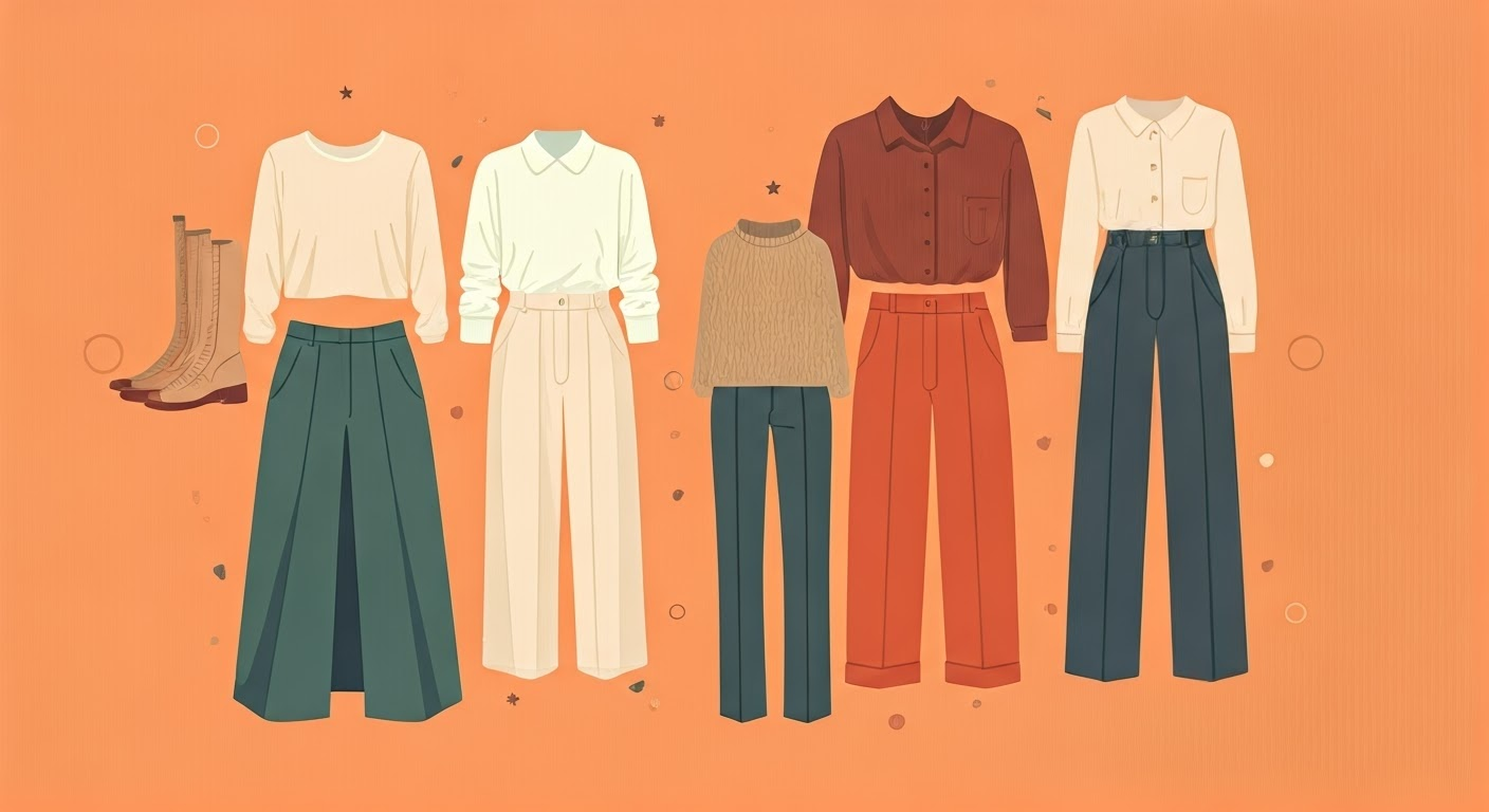
Having a good grasp of color coordination can elevate your style immensely. It helps ensure that your outfits are visually appealing and harmonious. Good color coordination in clothes doesn’t necessarily require matching colors perfectly. Rather, it’s about understanding and leveraging the power of contrasting and complementary colors to bring out your natural beauty, as well as working with different tones, shades, and tints to create outfits that express your personal style and flatter your natural looks.
The 60-30-10 rule
One popular guideline in fashion (also seen in interior design) is the 60-30-10 rule. This principle suggests that you choose three different colors for your outfit and use them in a ratio of 60%, 30%, and 10%.
The dominant color (60%) serves as the backbone of your ensemble. This is usually a neutral or subdued hue that forms the basis of your outfit. The secondary color (30%) should contrast or complement the dominant color to bring interest and balance. The accent color (10%) is the ‘pop’ color that injects vitality and personality into the outfit.
For instance, you could wear a light blue silk blouse (dominant), a medium blue tweed skirt (secondary), and accessorize with a rich red handbag (accent).
Using neutral and accent colors
Playing with neutral and accent colors is another way to create stunning, balanced outfits. Neutrals are flexible colors that you can pair with just about any color without clashing. They typically include black, white, gray, nude, and sometimes navy and brown.
Accent colors are those that you use in smaller amounts to make your outfit pop. These can be vivid shades like bright red, royal blue, or emerald green, or also softer hues like blush pink or mint green.
You can create an elegant look with a black dress (neutral) accented with gold accessories, featuring an interesting neckline. Or bring a touch of fun to a gray suit (neutral) with a vibrant purple tie or scarf (accent). The key here is balance – let the neutral ground your look, while the accent adds character and interest.
Also read: Capturing the Best Shots: Apparel Product Photography Guide
Partner with FlixStudio For Stunning Fashion Photography With Colors
At FlixStudio, we bring your fashion vision to life through expert photography that masterfully integrates the principles of color theory. Whether you’re showcasing bold couture pieces or subtle everyday wear, our team ensures each shot captures the perfect harmony of hues to highlight your products. By blending complementary colors, creating dynamic contrasts, and aligning tones with your brand identity, we craft imagery that commands attention and evokes the desired emotion. With FlixStudio, your fashion products don’t just look good—they captivate, inspire, and leave a lasting impression. Let us transform your collection into a vibrant masterpiece that resonates with your audience.
Conclusion
Understanding color theory for fashion design and clothes isn’t just about choosing colors you personally like; it’s about knowing how colors interact with each other, how they influence our perception and mood, and how best to use the main color schemes to enhance your natural appearance. If you’re gearing up for a fashion photoshoot, understanding and applying color theory can make a significant difference. Begin by analyzing your wardrobe, experimenting with new combinations, and slowly introducing new colors. Over time, you’ll see your style evolve, becoming more refined and distinctly you.
Frequently Asked Questions
1. Why is the color scheme important in fashion photography?
The color scheme sets the tone and mood of the photograph while ensuring the clothing or accessories stand out. It helps create a cohesive and visually appealing image that aligns with the brand or concept of the shoot.
2. How should I choose a color scheme for fashion photography?
Start by analyzing the outfit or accessory you want to highlight. Select complementary or contrasting colors that enhance the subject. Consider the theme of the shoot, the target audience, and the setting to develop a harmonious palette.
3. What role does the background color play in fashion photography?
The background should complement, not compete with, the outfit. Neutral tones can keep the focus on the clothing, while bold backgrounds work well for minimalist outfits or editorial shoots. Ensure the background supports the overall mood and style of the shoot.
4. Should the color scheme match the brand’s aesthetic?
Yes, aligning the color scheme with the brand’s aesthetic ensures consistency and reinforces brand identity. For instance, if a brand uses pastel tones, the shoot should incorporate similar hues for a cohesive look.
5. How can lighting affect the color scheme in fashion photography?
Lighting dramatically impacts how colors appear in a photograph. Soft lighting can make colors look muted and romantic, while harsh lighting can make them more vibrant and bold. Test your lighting setup to ensure it complements the chosen palette.